
Every newly founded brand requires a lot of attention to the huge amount of work that needs to be done when creating branding. We have created a thorough visual identification for products offered by a family apiary Dolina Tatr.
About project
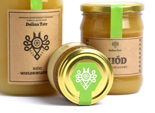
We designed the branding of products offered by the family apiary. The logo includes the parzenica folk pattern that originates from the culture of Polish Highlanders.
The image has been complemented by the pattern drawings of bees and the hexagon motif – the honeycomb shape. To distinguish between the types of honey and the products that are based on honey, we prepared a different color for each.
Result
On this basis, we designed the labels and covers for packaging. We also used the Highlanders’ dialect on the labels to emphasize the local character of the product.
Basing on the style of the labeling and branding, we created a design of the internet store for the brand, as well as promotional materials for the physical shop. The entire style, though modern and minimalistic, brings about traditional values that are an integral part of the honeys of Dolina Tatr.


Our goal was to create a brand that will bring to mind traditional, healthy and high quality products, produced locally.
Maciej Młynek, creative director


Did you like our project?
Fill in the form and see what we can do for your company.
See Also

Title
Description
Title
Description
Title
Description
Title
Description
Allegro Green Parcel Machines
Designing parcel lockers

Virgin Mobile – Banner campaigns
Banner campaigns

DKMS
#DobryWzór [#DesignedToDonate] - Online campaign for DKMS Foundation

Wokas – Spot
Spot for the campaign “Your plants will thank you”

VOXBOX
We’ve created a place to call home.